Faculty
Expanding and redesigning the professor profile and list pages within ESCP's Faculty section. The goal was to give visitors a more complete view of each professor while keeping the experience clear as the amount of information grew.

Visitors seeking an ESCP professor
Prospective students, journalists, corporate partners and academic peers, typically searching by name, department or area of expertise.
A profile page with limited content
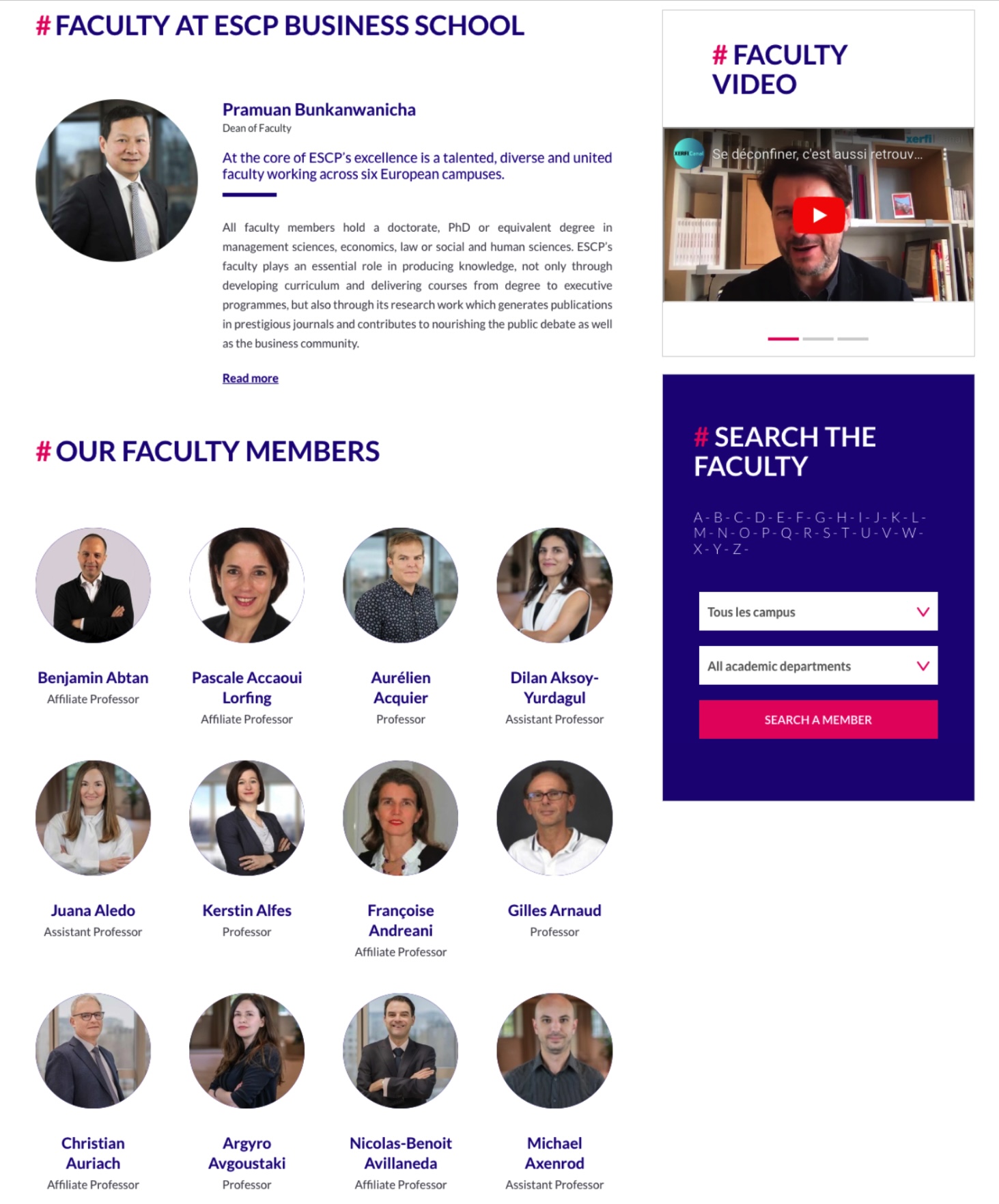
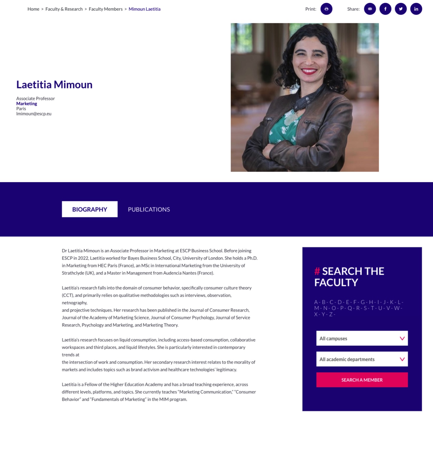
The professor profile page offered limited content, showing only a bio and a publication list, and did not reflect a professor's full professional background.
Content that scales, without losing clarity
Richer profile content, supported by a design that scales with a growing amount of information while remaining consistent and legible across every page.
A profile page with limited content
The Dean of Faculty brought the team's attention to a recurring issue raised by professors: the existing profile page showed only a bio and a publication list, so it did not represent their full professional background. Several gaps came up repeatedly in that feedback:
- No professional links, such as LinkedIn, a personal website or Google Scholar
- No dedicated space to highlight a professor's areas of expertise
- No concise summary combining research area and title at a glance
- No place for awards and honours
The list page and the profile page draw on the same professor information. We therefore redesigned them together to keep the experience consistent across both levels.
A benchmark focused on professional link presentation
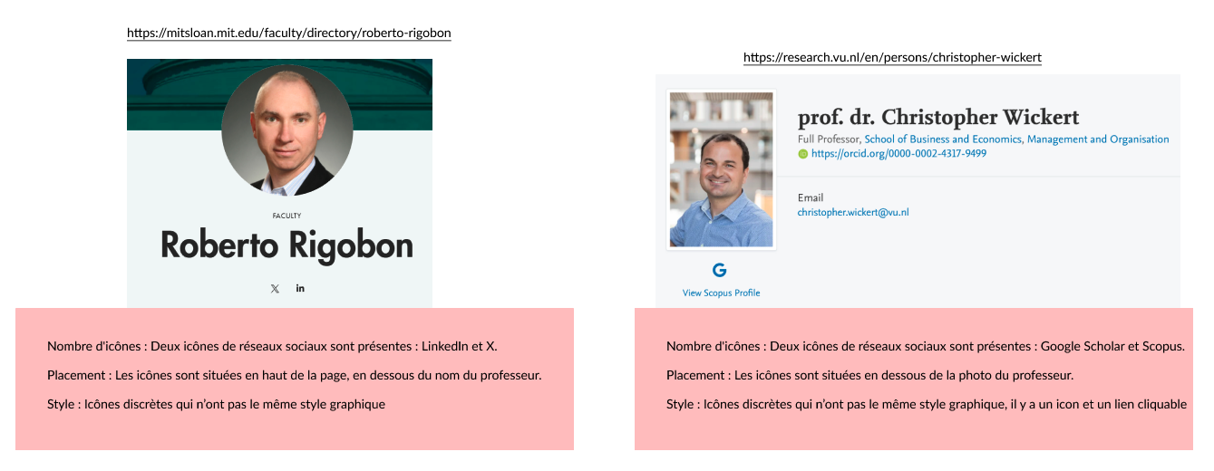
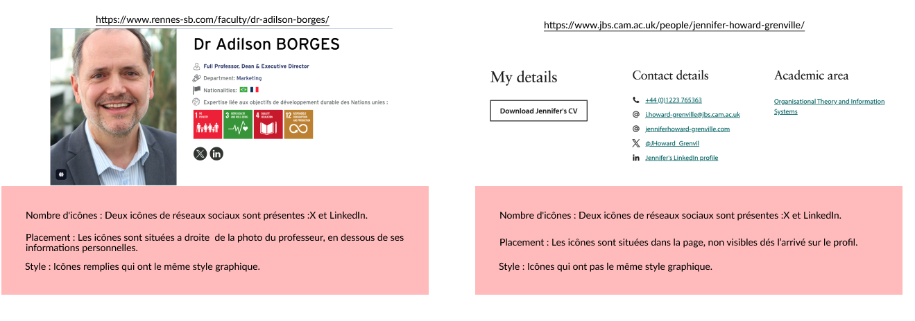
The professors' requirements were specific, so the benchmark focused on how four business schools—Rennes School of Business, Cambridge Judge Business School, MIT Sloan and VU Amsterdam—present professional links on faculty profile pages. We looked at icon count, placement and visual style.
Two observations stood out:
- Where icons were present, they were usually placed near the professor's name or title, giving them strong visibility.
- Their style was often inconsistent, both across icons on the same page and with the rest of the design, though the icons themselves tended to stay visually discreet.
Based on these observations, we recommended limiting the number of icons to two or three, prioritising the most relevant platforms for each professor. These would typically include X and LinkedIn, plus one additional option such as Facebook or Google Scholar. We also recommended placing them near the professor's name or title and keeping their style consistent with the rest of the page.
Keeping the page legible as content continued to grow
Unlike a project starting from a blank page, the professors' requirements were specific from the outset. The challenge was not defining what to build, but making each detail work: where a link should sit, how a colour would be perceived and how much information a card should contain. We developed the designs within ESCP's existing design system, keeping the new content aligned with the rest of the site and accounting for mobile from the start.
Partway through the project, the school reorganised its faculty title system. What had previously been a single level was expanded into two levels, with three top-level categories and several sub-categories. Because this change affected the list page's categorisation and filtering logic, we incorporated it into the redesign. Three decisions had the greatest influence on the final design.
Decision 1 · Richer list cards
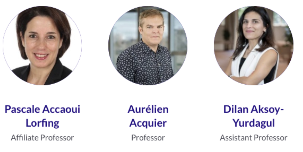
The list card originally showed only a name and a title. Adding each professor's area of expertise and email allowed users with a specific goal—such as finding an expert or getting in touch—to complete their task without opening the profile page.

Decision 2 · Profile links: from following the benchmark to revising it based on real use
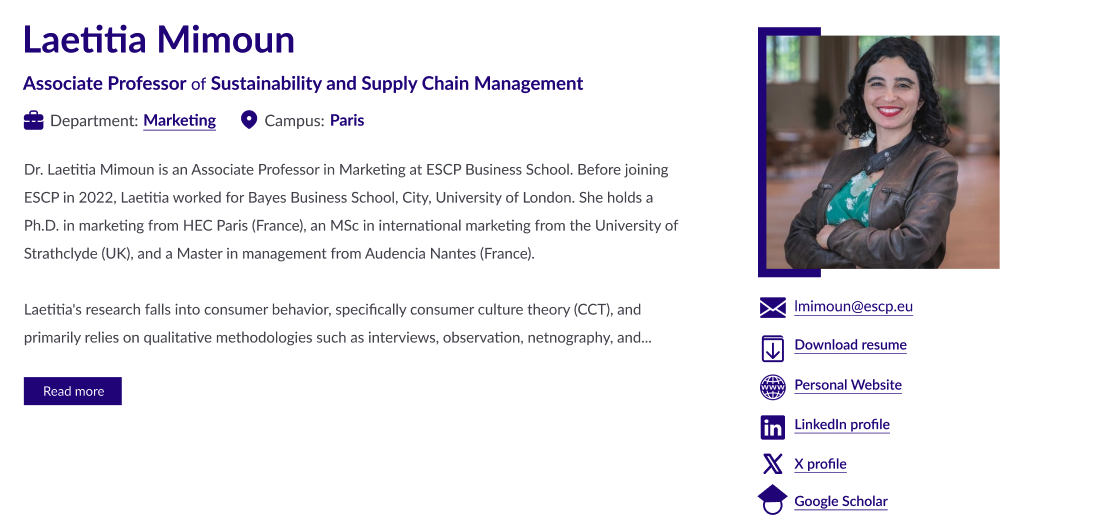
The initial design followed the benchmark recommendation, placing widely recognised icons such as LinkedIn and X near the professor's name, while less recognisable links, including a personal website, Google Scholar and a CV download, were placed below the photo with text labels.
In practice, some professors needed as many as seven or eight links. Feedback showed that splitting them across two locations scattered related information. We consolidated all links below the photo and gave each one a text label, keeping related information together. The benchmark was a useful starting point, but we revised the pattern once the real content requirements exceeded its initial assumptions.

Decision 3 · Title hierarchy: reinforcing colour with text for clearer recognition
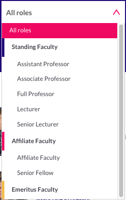
The three top-level categories are:
- Standing Faculty: Assistant Professor, Associate Professor, Full Professor, Lecturer, Senior Lecturer
- Affiliate Faculty: Affiliate Faculty, Senior Fellow
- Emeritus Faculty
The team identified a potential issue: a sub-category label alone does not always indicate its parent category, which can be unclear to visitors unfamiliar with academic title conventions. The label "Senior Fellow", for example, does not on its own indicate that it belongs to Affiliate Faculty.
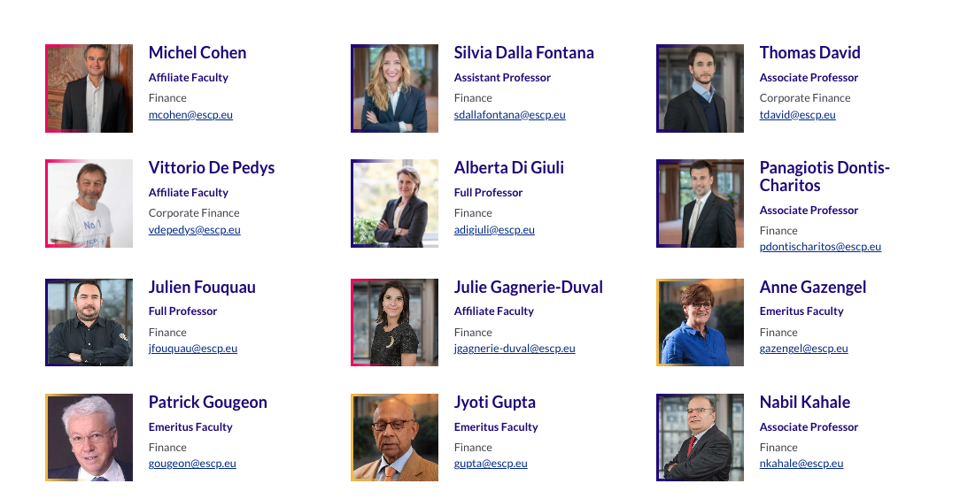
To address this, each top-level category was assigned a distinct colour, applied consistently in two places:
- As an accent bar preceding each group in the filter menu
- As a coloured border around each professor's photo on the list page
This allows users to identify a professor's category at a glance, without applying a filter. Colour was not used as the sole indicator: the title text remains visible on every card, with colour reinforcing rather than replacing that information. The site also integrates the EqualWeb accessibility widget, adding a further safeguard for users with colour vision deficiencies.
Direction for the next iteration, from an all-faculty meeting
Once the design was finalised, I presented it at an all-faculty meeting. The response was strongly positive: professors felt that the team had gone beyond their original requirements and refined details they had not explicitly asked for. They also raised a few opportunities for further iteration:
- Some professors requested a dedicated overview page for each department. At present, selecting a department only filters the professor list, without a general description of the department itself. This has been included in the next iteration.
- Other professors requested a more personalised, freely editable section. With around two hundred professors on the platform, this is difficult to implement at scale. There is no near-term plan for it, but it remains under consideration.
Live, with continued iteration planned
Outcome. The redesigned profile and list pages are now live. They include professional links, areas of expertise, research summaries, awards and the reorganised title hierarchy. The all-faculty presentation also surfaced several opportunities for the next iteration.
Reflection. The central challenge was keeping a growing body of information clear across three levels of detail: the card, the filtered list and the full profile. The solution could not rely on a single visual cue. It had to combine content hierarchy, labels and consistent patterns so that users could understand the information at each level.
View our faculty page ↗