Hide/Show
Redesigning visibility control across 2D and 3D applications in ENOVIA on the 3DEXPERIENCE platform, so users can isolate, hide and restore product components with fewer steps and clearer feedback.

3DEXPERIENCE power users
Professionals who work across 2D and 3D applications, managing product structures in one and inspecting the same assemblies in the other.
Visibility control that got in the way
Isolating part of an assembly took too many steps, visibility states were hard to tell apart, and parent–child behaviour was not clearly defined.
Simplify, clarify, define
A dedicated Hide/Show menu, a higher-contrast visibility icon system, and explicit inheritance rules between parent and child objects.
The work spans two connected applications: Product Structure Explore, where users manage and organise the hierarchical relationships within a product, and 3D Navigation, where they visualise and navigate the same product objects in 3D.

A recurring issue reported by multiple automotive clients
This was a B2B project for industrial software. Several key automotive clients (such as Renault and Porsche) reported the same kind of issue with Hide/Show operations when using industrial applications on the 3DEXPERIENCE platform. Because the feedback came from multiple clients, the product lead consolidated it into a formal project, defined the user pain points, and asked the design team to propose solutions. The design team had no direct access to clients, so I designed from the consolidated pain points and requirements. I supplemented them with a benchmark of AutoCAD, SIEMENS NX, JT2Go and Photoshop.
- 1. Isolating and restoring objects took too many steps, with no direct command.
- 2. Visible and hidden states were hard to tell apart at a glance.
- 3. The visibility logic between parent and child objects was not clearly defined.
Four tools, four models of visibility control
The redesign was grounded in an audit of how established design and engineering tools expose visibility: how commands are grouped, how state is represented, and where the control sits in the interface.


Groups visibility under a single Isolate menu with three commands: Isolate Objects (show only the selection), Hide Objects (hide the selection) and End Object Isolation (restore everything). A task-oriented model that shaped the new Hide/Show menu.

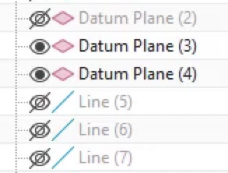
Eye icons signal visibility, black and white fills maximise contrast between states, and hidden parts have greyed-out titles. Keyboard shortcuts also offer a faster alternative path for frequent operations.


Checkboxes sit directly inside the structure tree, so users can see exactly where shown and hidden objects live in the hierarchy.


Three states (shown, hidden, partially hidden) are told apart by icon transparency, communicating parent–child status at a glance.
Takeaways. Consolidate related commands into one menu, reinforce state with more than one cue (icon and text treatment), and make partial states explicit.
Two new commands, one dedicated menu
A new Hide/Show menu in the toolbar groups two explicit commands for the most common visibility tasks. This keeps the interaction intuitive and lowers the learning curve.
- Isolate in 3D displays only the current selection and hides all other objects.
- Show all in 3D restores every object to view.

A clearer visibility-state icon system
The visibility icons were resized, repositioned and paired with greyed-out titles for hidden parts. The stronger contrast between the two states lets users read the structure at a glance, without inspecting each row.

Predictable parent–child behaviour
Visibility in a product structure is hierarchical, so the behaviour between parents and children was defined and confirmed with three rules.
- Hide a parent: all of its children are hidden too.
- Show a parent: all of its children are shown, regardless of their previous states.
- Show a child of a hidden parent: the parent never blocks the action, and the child becomes visible.


Design adopted and developed, with positive user feedback
This project taught me that designing for industrial, multi-function software is far from easy. A new feature must not disrupt the large set of existing functions, yet it has to build on them. That makes information architecture and logic mapping the most important part of the work, more so than the look of any single screen.