School of Technology
Introducing ESCP's newly announced School of Technology within an existing site built around a single Business School. The work had to move from design to development in two weeks, without redesigning the site's information architecture.

Visitors discovering ESCP's new school
Prospective students exploring the Bachelor in Management Science and Technology, and existing site visitors moving between the Business School and the new School of Technology.
A new school, two weeks, one live programme
ESCP's strategic plan called for a School of Technology alongside the Business School. The team had two weeks, design to development, and only one programme to build around.
Distinguishing without redesigning
A reused banner, a course finder filter and a dedicated introduction page helped distinguish the two schools without a full redesign of the site's navigation or information architecture.
A new school, and the question of how to represent it online
ESCP announced its “Bold & United” 2026–2030 strategic plan, aiming to move from being the world's first business school to becoming Europe's first University of Management. The School of Technology is one step in that transformation.
The new school needed a presence on the site before launch, so integration became a key concern. The brief was to design a dedicated introduction page for the School of Technology within two weeks and determine how it should fit into the wider site. Two constraints shaped the scope: there was not enough time or content to support major changes, and only one programme was public. The central question became how to distinguish the Business School from the School of Technology.
How universities structure schools across domains, navigation and course finders
The team looked at how other universities integrate schools within larger institutions. The benchmark covered Harvard, Columbia University, Cornell University, Stanford University, Coventry University, Nanyang Technological University, the University of South Carolina and the University of Sydney. We compared four aspects: site architecture, global navigation, school pages and course finders.
- Sub-domains and shared domains. Most of the examples keep schools within the university's main domain, while Nanyang Technological University uses a sub-domain for one specific school. In that example, the university and school logos are presented together. A sub-domain gives a school more independence, but it also creates a more separate experience from the main university site.
- Global navigation. Harvard and Cornell make “Schools” directly accessible from the navigation, while Columbia and Stanford place the entry within the page content, making it less visible. Coventry lists its schools directly in the menu. Across the benchmark, “Schools” usually sits within a broader section such as “Academics” or “About Us”, rather than appearing as a top-level navigation item.
- School pages. Harvard and Stanford give their schools distinct visual identities through different logos, imagery and layouts. Columbia also uses different logos and colours, while Cornell keeps a more consistent institutional identity across its schools. The University of South Carolina uses a shared page structure and common domain, which makes it easier to move between schools but creates less visual differentiation.
- Course finders. Harvard and Stanford provide the most developed programme discovery experiences, including filters and programme comparison in some sections. Cornell and Columbia mainly present programmes as lists without a global filtering system. The University of South Carolina focuses on essential programme information, while Coventry uses school and campus filters, although combining both levels can make the structure harder to understand.
These observations directly shaped the decisions that followed.
View the Benchmark ↗Choosing the lightest solution that still worked
A separate school site or sub-domain could support a stronger independent identity, but it was not realistic within the two-week timeline, especially with only one public programme. Based on the benchmark, the team therefore explored how to distinguish the two schools within the existing site and menu while keeping the option of a more independent architecture for the future.
Considered · Reworking the menu hierarchy
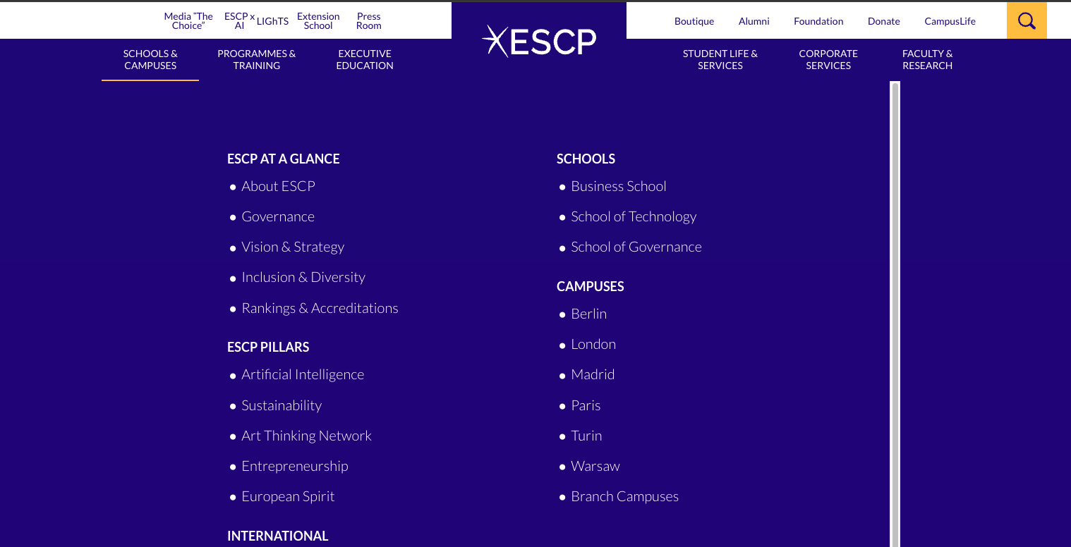
One early proposal was to redesign the menu so that the Business School and the School of Technology would have clearly separated areas. This would have required changes to the menu hierarchy, design and development. The time cost was too high for the scope of the launch.
Solution · Adding a School of Technology section
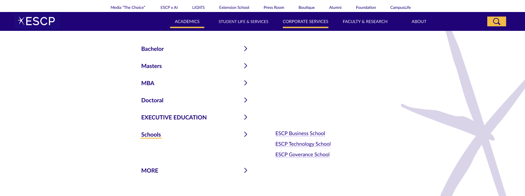
The team still needed to integrate the new school into the menu. Instead of rebuilding the hierarchy, we added a dedicated School of Technology section to the existing menu. This created a clear entry point for the new school while keeping the rest of the navigation unchanged.
Considered · Adding the school logo to the menu
We also considered using the School of Technology logo to distinguish the new section visually. Because the logo shares ESCP's mark and differs mainly in its wording, adding it to the menu risked creating repetition next to the existing ESCP branding. It was therefore treated as a separate visual direction rather than the solution to the navigation problem.
Considered · A second logo on the programme page
Another direction added the School of Technology logo to the programme page itself. With only one public programme, the team decided that the additional branding would not yet provide enough value to justify the extra visual complexity.
The full menu redesign and the additional logo treatments were set aside because the new school had limited content and visual material, and the launch timeline was short. The final solution combined the lighter menu update with three supporting touchpoints.


Solution 1 · A reused banner
The programme page already had a banner component in the site's design system. We reused it as a plain-text “ESCP School of Technology” banner on the only live programme page. This required no new component.

Solution 2 · A course finder filter
Following patterns observed in the benchmark, we added a School of Technology filter to ESCP's existing course finder. This allows the programme to be found and identified by school without changing the site's overall structure.
Solution 3 · A School of Technology introduction page
We also designed a dedicated introduction page for the school. This was UI work built from the content provided to the team, giving the School of Technology a clear home on the site before it had more than one programme to show.

Live, with a deliberately narrow scope
The School of Technology menu section, banner and introduction page are live on the site. The course finder filter is built and ready, but depends on a separate course finder redevelopment and will go live once that project ships.
View the page ↗Reflection. The key challenge was integrating a new school into a site that had originally been structured around one Business School. A full menu redesign could have created a clearer long-term model, but it was not proportionate to the launch scope. Adding one dedicated menu section, then supporting it with a banner, a course finder filter and an introduction page, created a usable entry point without delaying the launch.