Search + AI
Redesigning ESCP's website search from a basic input field into a structured experience that can become more intelligent over time.

All escp.eu visitors
Anyone looking for programmes, news, events, research or people on ESCP's website. Search is a key way to find content across a large site.
What users wanted couldn't be found
The legacy search was a single input field with low relevance. It often returned no results, yet many users still relied on it.
Structure first, intelligence later
Clear categories, tailored results and filters, and progressively personalised AI recommendations help users find content faster.
Built on Algolia's AI search and delivered in three phases: search and results first, filters next, and AI recommendations later. Phases 1 and 2 are live; Phase 3 remains in development.
Search that consistently failed to return results
The ESCP website is large and spans many content types, and search is one of the primary ways visitors navigate it. The existing search was limited to a single input field with low relevance and frequently returned no results. Analytics showed sustained usage despite this, signalling clear demand and making search one of the most visible weak points in the overall site experience.
The trigger. The team adopted Algolia's AI-powered search. To make those capabilities usable, we needed to redesign the search interface and its interactions. That became the starting point of the project.


Nine sites, evaluated to set the team's own direction
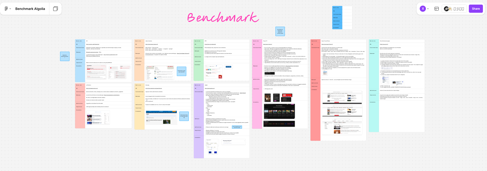
The team benchmarked search across nine major websites, evaluating each for functionality, key observations and potential sources of inspiration.
A few observations stood out: Paris.fr displays a result count next to each category, Ouest-France gives every content category its own visual style, and Algolia surfaces results instantly while typing and highlights the matched keywords.
Combined with Algolia's own capabilities, three takeaways shaped the approach most: content categories, filters, and page structure. These directly guided the design decisions that followed.
Making complex content searchable
The project started from a blank page, with no existing search logic to build on. As we explored Algolia's capabilities—autocomplete, query suggestions, typo tolerance, synonyms, filtering, AI recommendations and personalisation—the scope continued to grow. The challenge was not any single feature. It was deciding what to introduce first and how to structure the experience around it. Four decisions shaped that scope.
Decision 1 · Categorise by content type, and show result counts
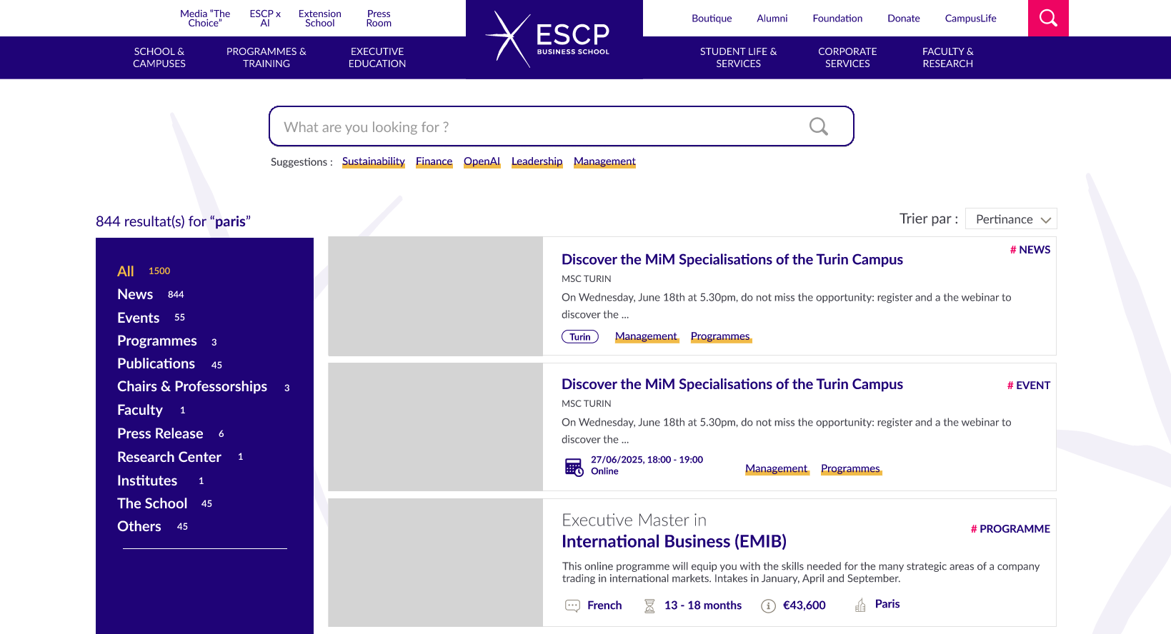
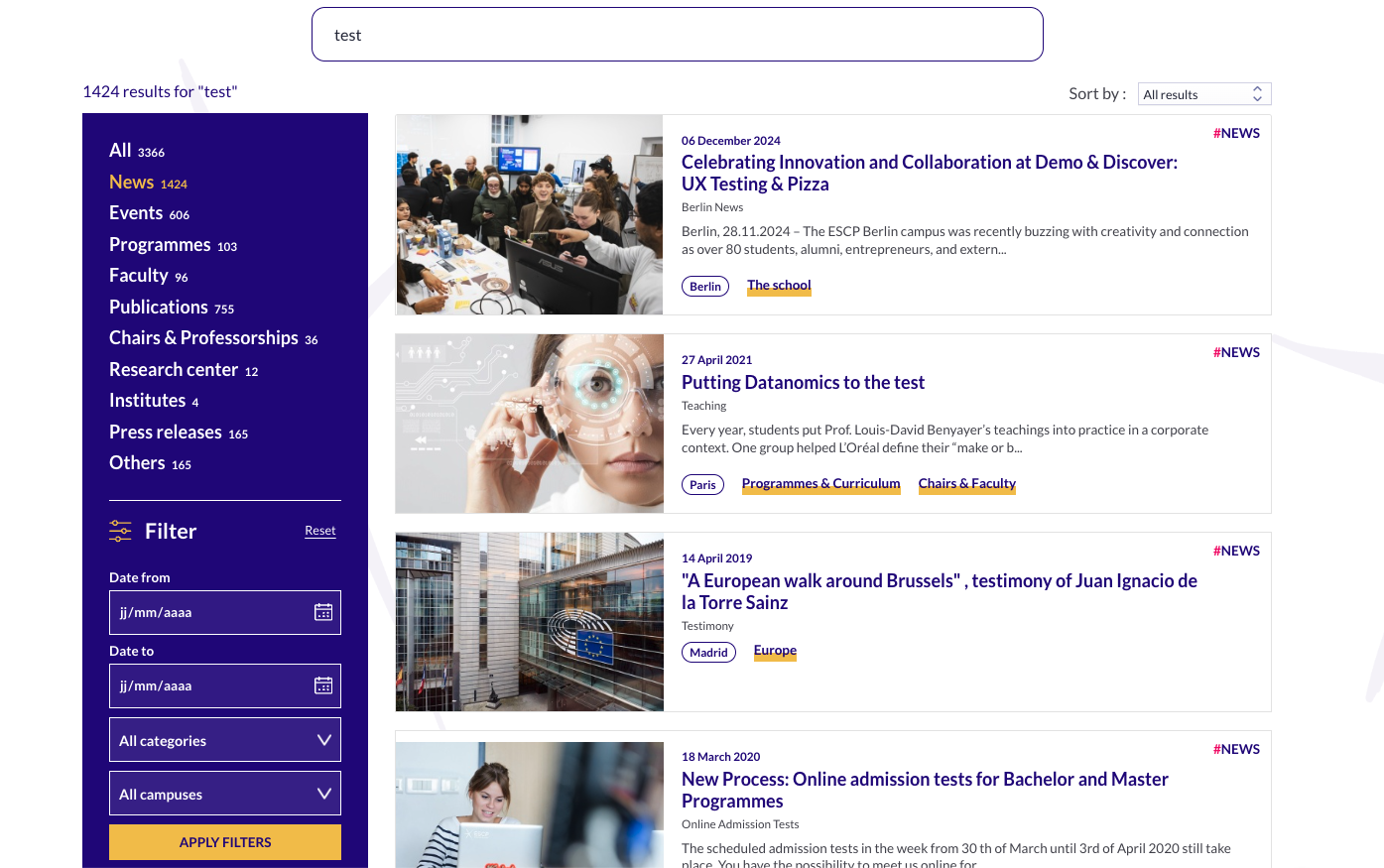
The site holds many types of content, so to present it more clearly, results are grouped into 11 categories: News, Events, Programmes, Publications, Chairs & Professorships, Faculty, Press Release, Research Center, Institutes, The School and Others. Each category shows the result count for the current search, so users can see how results are distributed before deciding where to look.
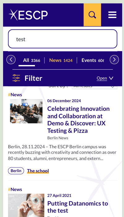
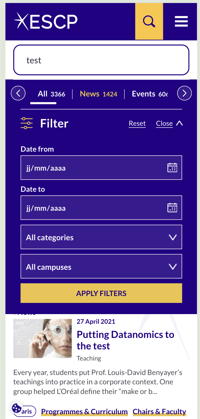
On mobile, these categories were initially housed within a hamburger menu. Switching between them required multiple taps, which added friction to a core interaction. We replaced the menu with a horizontally scrollable tab row at the top of the page. Users can now switch categories in one tap while keeping the results visible underneath.
Decision 2 · Different content types show different information
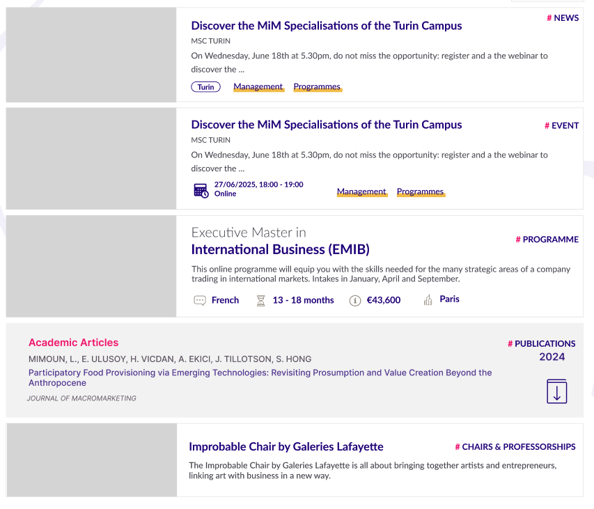
Beyond a title and description, each result shows details specific to its type: news shows the publication date, programmes show language, duration and price. Users can judge relevance without opening the result.
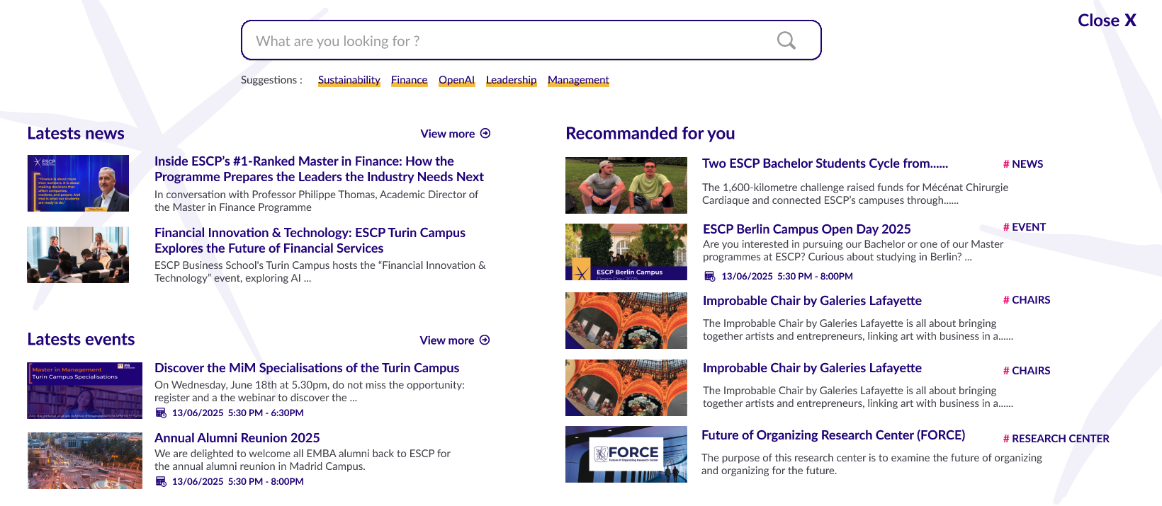
Decision 3 · Progressive AI recommendations
The search box page shows the latest content by default. Algolia's AI can use search history associated with the same cookie to recommend relevant categories. A new user has no history, so the experience starts from a safe default and can personalise gradually as activity accumulates, rather than relying on AI from day one.
Decision 4 · Filters, scoped to where they add value
Filters let users narrow results further within a category, such as by language and tuition for Programmes, or by publication date for News. They were introduced only for the categories with a genuine filtering need, namely News, Events, Programmes and Faculty. On mobile, filters are presented as a dropdown, a more compact interaction suited to the constraints of a smaller screen.
Core first, intelligence later, refined through real use
Given the number of features involved, waiting until everything was complete would have delayed useful improvements and reduced opportunities to catch issues early. We therefore sequenced delivery into three phases based on dependency and value:
- Phase 1 · Search box and results page. The core of search. Without it, there is no search.
- Phase 2 · Filters. These make search more accurate and surface a clearer picture of user needs.
- Phase 3 · AI recommendations while searching. A valuable enhancement, but only meaningful once the first two phases are solid.
Each phase could ship independently. Phases 1 and 2 are live, while Phase 3 is still in development.
Details that only surfaced after development
During small internal tests before launch, colleagues surfaced several interaction details that had not been anticipated in the design files. We addressed them as follows:
- Applying filters with Enter. The original design triggered filtering through a button click. Internal testing showed that users expected Enter to submit the filter, so we added support for it.
- Typing straight after clicking the search icon. Originally, users had to click the search bar again before typing. I proposed focusing the input automatically after the icon click, saving one click.
- Returning to the top after applying a filter. When users scroll down through results and then apply a filter, the page needs to jump back to the top so the new results are visible.
These details were not about how the interface looked. They were about users' habits and context of use—things that design files alone cannot validate.
Live, with early signals to monitor
Reflection. Search touches every content type on the site, so the central challenge was making that underlying structure understandable. More categories required more filters, and more filters revealed more distinct user needs. My approach was to address the most basic and urgent needs first, then continue improving after launch rather than aiming for completeness from day one. The early filter usage already gives the team a clearer picture of which content areas people actively explore, while the longer-term impact still needs more data.
Try our AI search ↗